Usable Security: Timing of Information?
As I’ve read Kahneman’s “Thinking, Fast and Slow,” I’ve been thinking a lot about “what you see is all there is” and the difference between someone’s state of mind when they’re trying to decide on an action, and once they’ve selected and are executing a plan.
I think that as you’re trying to figure out how to do something, you might have a goal and a model in mind. For example, “where is that picture I just downloaded?” As you proceed along the path, you take actions which involve making a commitment to a course of action, ultimately choosing to open one file over another. Once you make that choice, you’re invested, and perhaps the endowment effect kicks in, making you less likely to be willing to change your decision because of (say) some stupid dialog box.
Another way to say that is information that’s available as you’re making a decision might be far more influential than information that comes in later. That’s a hypothesis, and I’ve been having trouble finding a study that actually tests that idea.
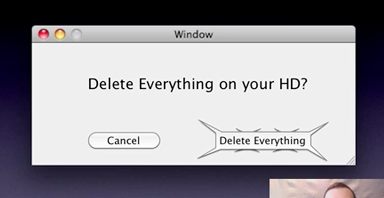
For example, if we use a scary button like this:

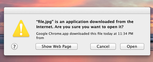
would that work better than this:

If someone knows of a user test that might shed light on if this sort of thing matters, I’d be very grateful for a pointer.