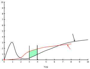
An Example of Our Previous Graph In Action
I wanted to throw it out here as an example of how you would the model from my earlier post in real life. So let’s take the recently released Internet Explorer security vulnerability and see how it fits. Now this is a pretty brain-dead example and hardly requires a special tool, but I think it illustrates the use quite nicely. As a refresher, the black line indicates the general path of vulnerabilities for a particular technology (in this case it could be browsers, or IE specifically) and the red line indicates the deployment of that technology within an organization. I’ve added arrows to indicate approximately where on the curve this vulnerability fits and where, for just about every organization on the planet, the deployment of IE is.

Looking at the two curves and the placement of the arrows, we can see that, barring other issues, addressing this particular issue should be high priority. In our next post, you’ll see some other issues you may want to take into consideration in order to find the priority of this vulnerability relative to other vulnerabilities you may be facing.
One comment on "An Example of Our Previous Graph In Action"
Comments are closed.