More breach visualization
I received some excellent comments on my previous breach visualization post, which I wanted to highlight for EC readers and take a stab at addressing.
Ka-Ping Yee very diplomatically takes me to task for creating nutrition-free eye candy just because it was easy. This is an important criticism, which I think has two components. The first component is the “So What?” test: does the pretty picture help bring out anything important about the underlying data, or is it wallpaper for the self-important? I do not deny that it may be the latter, but for reasons listed by Allan in his comment — which I will address shortly — I think it certainly does the former.
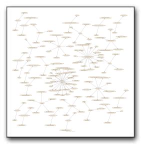
The second component centers on whether the visualization is in some sense informationally optimal. In other words, is the S/N ratio as high as it could be. Adam’s comment is about this as well, and the answer is “no”. Omitting all disconnected two-node subgraphs (as Adam subtly suggested) helps, as can be seen below. (Note that I cranked this image out late at night, and have not gone back to validate my work. I think the result serves to answer Adam’s question.)
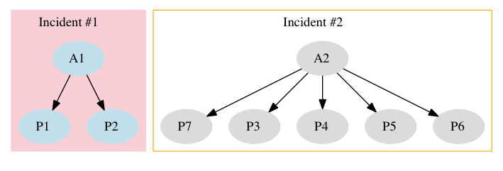
Beyond this tidying up, I think it would be desirable to somehow group nodes which are involved in a single incident. The added complexity reveals enough about the structure of the incidents to make it worth doing. Something like this:

I’m not sure how to programmatically generate the subgraph information, but I’ll look into it. I appreciate being spurred to action by Ka-Ping Yee’s (and Adam’s) remarks.
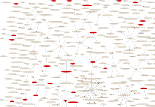
Allan makes a couple of keen observations as well. First, he wonders what the heck is up with the Principal-Agent relationships shown in this visualization. The graph is drawn such that an arrow leading from Entity A to Entity P indicates that Entity A was breached, exposing Entity P’s data. As Allan suggests, there seem to be some anomalies. Consider for example, the many Type P nodes labelled “Unknown 1”, “Unknown 2”, etc. Surely it is more likely for a company to report a breach involving its data as exposed by an unnamed third party than it is for us to learn of a third party who was breached, but somehow not learn the names of the actual data owners (who, after all, have the duty to notify those whose PII was exposed). To see what I mean, consider the revised image below (click to literally get the big picture), in which anomalous nodes are colored red.
The intuition is that any entity that seems to have issues with multiple Agents is worthy of inspection as a possible data entry error. I did the coloring manually, but it would be trivial to perform programmatically, and provides a valuable visual check that coding standards have been adhered to.
Allan’s second point, I think, is that the picture helps the viewer generate hypotheses, or at least want to look more closely at the underlying data. I think those are both fine things, and if my noodling with Graphviz helps, I’d say it’s time well-spent.
As always, your feedback is very much appreciated.


Yes, much more illustrative. Thank you. If I’m not mistaken the diagrams show no interrelated breaches other than Citi. This begs the question of why not just use a list view instead of radial? Radial seems best for highlighting complex interrelationships, which do not seem to exist here.
Thanks, that’s a very interesting second graph, and it raises Allan’s question–is this a scale free exponential drop off? Why? Aren’t there a lot of big service providers? Shouldn’t we see a U shape?