Breach Visualization
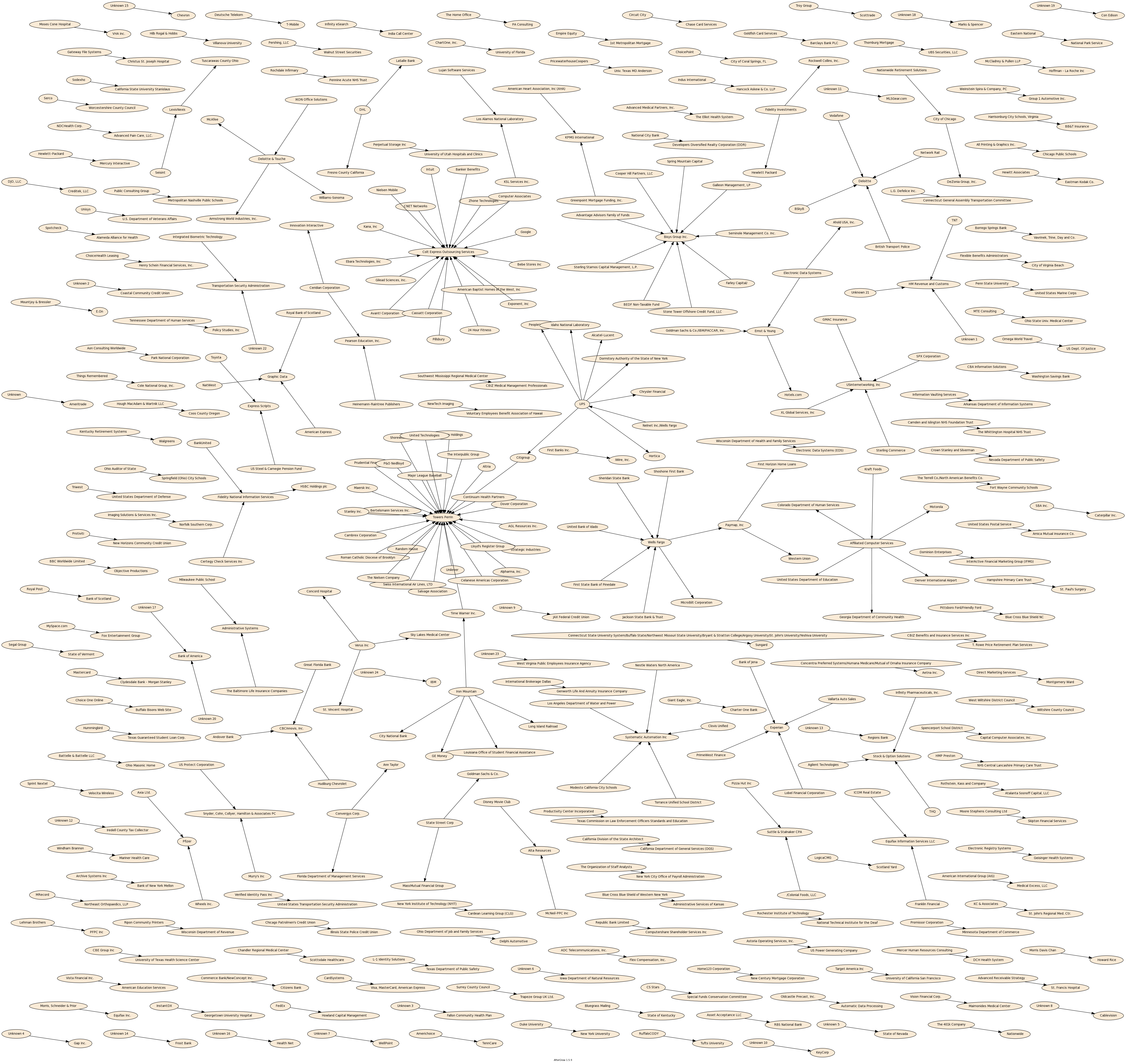
I took the latest DataLossDB.org breach database [link to http://datalossdb.org/download no longer works] and extracted all breaches involving a third party, omitting all columns other than the reporting entity and the third party. I then ran the resulting two-column CSV file through afterglow, and finally made pretty (3MB) picture with graphviz.
This was done more for fun than for insight, but I thought others might be interested.
Cool!
What happens if you drop everything where both a & b have a single edge?
Argh, I’m tired of these graph drawings. There are way too many drawings like this on the Web. This is, for me, in the category of visualizations that are extremely common because they are easy but are almost never useful.
Apologies that this peeve is coming out here and now — it is not directed personally or specifically at this drawing only. This is just one instance.
Argh, I’m tired of these graph drawings. There are way too many drawings like this on the Web. This is, for me, in the category of visualizations that are extremely common because they are easy but are almost never useful. For almost any user task you can imagine, this style of drawing is not a good solution.
Apologies that this peeve is coming out here and now — it is not directed personally or specifically at this drawing only. This is just one instance.
Interesting.
To address a little of Ka-Ping’s gripe, I can share a little of what I learned from a few moment’s perusal, (and what I did not learn):
– The largest component is still quite small (although what the interpretation of a large connected component would be, I don’t know)
– Possibly a scale free distribution of degree (although we’d need to see the numbers to judge)
– Iron Mountain was not involved as nearly as many as I had suspected from my earlier involvement with this data.
– The sheer number of third parties handling others data (would be nice to see some descriptive statistics of those firms)
– It is not always obvious to guess, from a given pair of firms, which was the principle and which the agent.
@Adam: Coming soon to a blog post near you.
@Ka-Ping: I feel your pain. Like I said, this was done more for fun than for insight. That said, I agree with Allan that there is some info here, and some food for thought. Now that I have my feet wet, I plan to make some changes which I hope will be useful.
@Allan: Agreed on all counts. I am particularly struck by the principalagent issue. Also, the element of time is missing: if a single tape with data from 100 firms is lost, it means (sez I) something different than if the same agent loses 100 firms’ data in 100 incidents, but the graph would look the same. There’s a way to indicate the boundaries of sub-graphs, so perhaps a per-incident subgraph indicator would be useful.
@Ka-Ping
So how would you improve this?