Visualization Friday!
Yesterday I got to see what might have been one of the most amazing(ly bad) security dashboards I’ve ever seen. And those who have read my posts on visualization know that I find the visualization of risk & security to be a pretty fascinating field of study. So given the quality of the GRC apps I’ve seen, the dashboard I saw yesterday and my love for data visualization, I thought I’d take Friday to post a few things that came across my data analysis & visualization feeds that you might find interesting. If you guys like it, we’ll stick with it.
From the WSJ a visualization on GDP growth and various investment bubbles since 1994. GDP growth is the gray line that shows steady growth with little dramatic variation. I would have liked to see that line a little more pronounced because it is the reference that puts the rest of the plotted lines in context:
_ http://online.wsj.com/article/SB124526883036724391.html#articleTabs%3Dinteractive
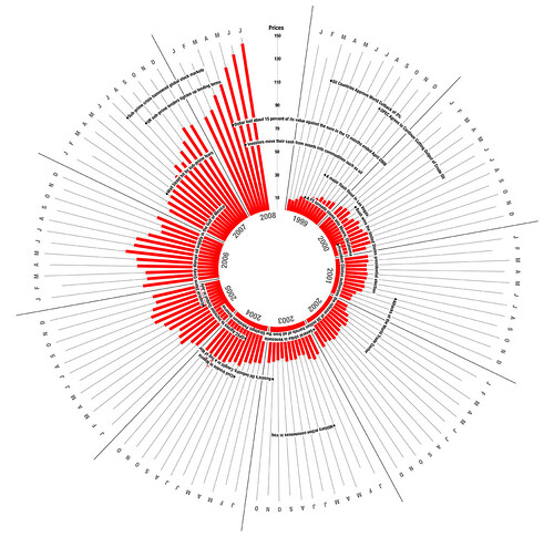
Two visualizations on Oil prices present the similar information in a very interesting manner:
http://www.flickr.com/photos/27534298@N02/2963174874/in/pool-767445@N24
and
http://chartporn.org/wp-content/uploads/2009/06/image45.png
I like the idea of using interactive charts. Here’s one from NPR that shows various information about the US electric grid, and one from the AP that shows their economic stress index over time. I think it would be really interesting to evolve the idea of “heat maps” to reflect business processes, risk, data types, data owners, and configuration specifics and use the visual to see if we can’t quickly draw ad-hoc correlations.
http://www.npr.org/news/graphics/2009/apr/electric-grid/
http://hosted.ap.org/specials/interactives/_national/stress_index/
Here’s a recent WaPo “infographic” that just shows information on what the current Obama administration in the US wants to do to the financial markets:
http://www.washingtonpost.com/wp-dyn/content/graphic/2009/06/17/GR2009061703025.html?hpid=topnews
Thought it was an interesting format for a one page document that could be given to non-technical IT staff to discuss current risk mitigation strategies or co-ordinated efforts designed to accomplish one goal (like a PCI effort), what have you.
Finally, I’ll leave you with the WSJ economic forecast interactive infographic:
http://online.wsj.com/public/resources/documents/info-flash08.html?project=EFORECAST07
Have you seen SecViz? There are a number of security visualizations that people came up with. I haven’t seen many people submitting dashboards yet, but I have built some in the past…