Tufte, Godin, Juice Analytics
 Juice Analytics comments on “Godin’s take on Tufte:”
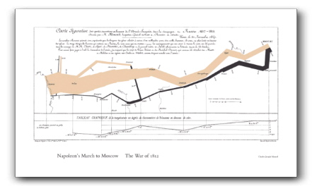
(Godin) I think this is one of the worst graphs ever made.
He’s very happy because it shows five different pieces of information on three axes and if you study it for 15 minutes it really is worth 1000 words.
I don’t think that is what graphs are for. I think you are trying to make a point in two seconds for people who are two lazy to read the forty words underneath
I think Seth has it just right. Personally, I can hardly resist the a well-constructed infographic, but I have an unnatural interest in data. For the many business users, better to construct information displays that are simple and to the point.
So, Seth’s points are good. They’re made in this video presentation at GEL 2006 (Google video, worth watching).
I’m really irritated by Juice’s words. It is never better to construct information displays that are simple and to the point, absent an understanding of why you’re constructing a display. If your point is “Napoleon lost a lot of lives attacking Russia” maybe a bar graph would do. Sometimes complex reasoning requires complex data. The question is not “Should your graphics be simple and to the point,” but rather “do my graphics help present the data and help people reason about it?”
To put it another way, start from the user story, use case, or scenario, and construct your information presentations to help that story along. Then, and only then, should you make it as simple and to the point as possible, but no simpler.
I completely agree when you say “start from the user story, use case, or scenario, and construct your information presentations to help that story along. Then, and only then, should you make it as simple and to the point as possible, but no simpler.”
Maybe there is some confusion about the distinction between simple and simplistic. I don’t believe anyone is advocating the latter. For me, simple means synthesizing so that you are only displaying the key messages. For the business audience that I’ve encountered, there isn’t a lot of patience to puzzle out the meaning of a complext graphic — so it is critical to make the extra effort to get to a very focused message. (A favorite quote: “I wouldn’t give a fig for the simplicity this side of complexity, but I’d give my life for the simplicity on the far side of complexity.” — Justice Oliver Wendell Holmes)
Another way to think about it: The Minard graphic, while intriguing and useful as an “exploratory” graphic, does not perform as an “explanatory” graphic.
I agree with the spirit of of Juice and Godin, but not the letter. The objection they have to the Minard graphic is that it takes a full paragraph to explain how to read it. In the context of a presentation, the exposition it takes to explain the graphic is equivalent to the exposition required to make the point the graphic is trying to make. The Minard map is not a good powerpoint slide.
The obvious rebuttal is, the Minard map isn’t meant to be a powerpoint slide. In the proper context, it’s a marvel. Of course this is true. The second rebuttal is, why are we wasting time making powerpoint slides anyhow? This gets into a deep, wanking philosophical discussion about the nature and purpose of presentations. You might as well debate whether Pet Sounds is truly a better album than London Calling.
But there’s DEFINITELY an emperor’s-new-clothes thing happening with Tufte, and I’m glad he’s getting poked. Like the Design Patterns movement, there was a simple idea in all 3 of Tufte’s later books (design for clarity and information density), but his audience latched on to all the anecdotal details and codified them, and Tufte has gone along with it. Which is why you can’t use pie graphs in front of these people without someone telling you that you’re wasting a whole DIMENSION of space, and won’t someone please think about the children?
(There’s another, more insidious jab I’d make at Tufte, which is that his insights have a lot to do with his own aesthetic values; use a lot of low-saturation colors, set type in Gill Sans, print on expensive paper, and you get the stamp of approval regardless of your content. A lot of what wins Tufte over seems to score primarily on “prettiness”, “calm”, and “order”; fine aesthetic goals, but not Platonic ideals.)
If you can’t see the value of a pie chart, you need to snap out of it. Juice is basically saying, “In a presentation, the first 1/4 inch column of Minard, where you see the size of the outgoing invasion and incoming retreat, conveys 90% of the value of the picture without requiring a huge explanation”. I think he’s right. I agree that you shouldn’t simplify “too much”, but then, you shouldn’t do anything “too much”.
The Visual Display of Quantitative Information is hugely important and I will force my kids to read it before High School. Then I’ll make them read Elements of Typographic Style, teach them to make sure they use light grey for their table borders, and send them off into the world with the Tufte merit badge.